
Plugging-in for exceptional user experience
Designing for the new age of EVs
Client Tap&GO EV
BACKGROUND
In accordance with British Columbia's legislative mandates, the transition from selling new gas-powered vehicles to electric vehicles (EVs) will be fully realized by 2035. To accommodate the anticipated surge in demand, EV charging infrastructure across the province must expand and modernize.
The formation of Tap&Go EV stemmed from a compelling motivation to drive innovation within the sphere of EV charging infrastructure. Faced with intricate challenges in this area, the team dedicated themselves to devising novel solutions.
BIG IDEA
Using UX research and design to pioneer a new era in the EV charging experience.
AN AMBITIOUS VISION
Tap&Go’s goal is to provide EV electrification services and management solutions across North America for EV drivers and organizations with EV fleets. They were determined to secure a large electrical utility as their first significant B2B client, intending to set a precedent for future partnerships – but they knew it wasn’t going to be easy.
To win this client, Tap&Go needed to meet minimum standards that the electrical utility set for their existing system, EV fleet, and service delivery to hundreds of thousands of people living in the province. Knowing they would need experts in research and design to surpass these requirements and achieve exceptional product design, Tap&Go enlisted the expertise of Spatial.
DISCOVERY PROCESS
Understanding the problem space
We began by conducting a competitive analysis and reading user reviews of existing EV charging services. This allowed us to gauge challenges and pinpoint gaps so opportunity areas could be identified and addressed by Tap&Go.
Next, we engaged the large electrical utility company to better understand their rigorous criteria for a Minimum Viable Product (MVP). We paid special attention to the challenges faced in their existing service delivery and their desired future state.
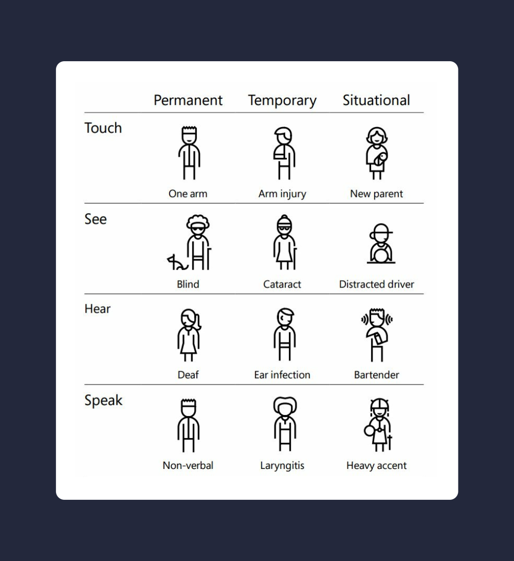
Ensuring the design considered the needs of eventual users was a critical concern for our team. We conducted an Inclusivity Impact Assessment (IIA) to evaluate potential effects on audiences so we could integrate these insights throughout the project.
Remote areas pose connectivity challenges
Charging stations installed along remote highways present the challenge of poor or non-existent data reception. How this affects the charging experience for EV drivers needed to be carefully considered for Tap&Go's system design.
Forming insights and providing recommendations
Tap&Go's vision for a comprehensive B2B and B2C system involved several audience user groups with a variety of different needs regarding interface design and modes of access; for the MVP, we recommended crafting a web application and focusing on the EV driver's experience. This enabled the project team to concentrate on developing a thorough and well-thought-out design that could be tested in real-world conditions, accelerating the project timeline.
Our team of UX designers also identified that plain language, reduced complexity, and consistency should be top priority considerations in the upcoming design stage; this was especially important based on both the outcome from the IIA and the technological innovation Tap&Go wished to incorporate.
DESIGN PROCESS: PHASE 1
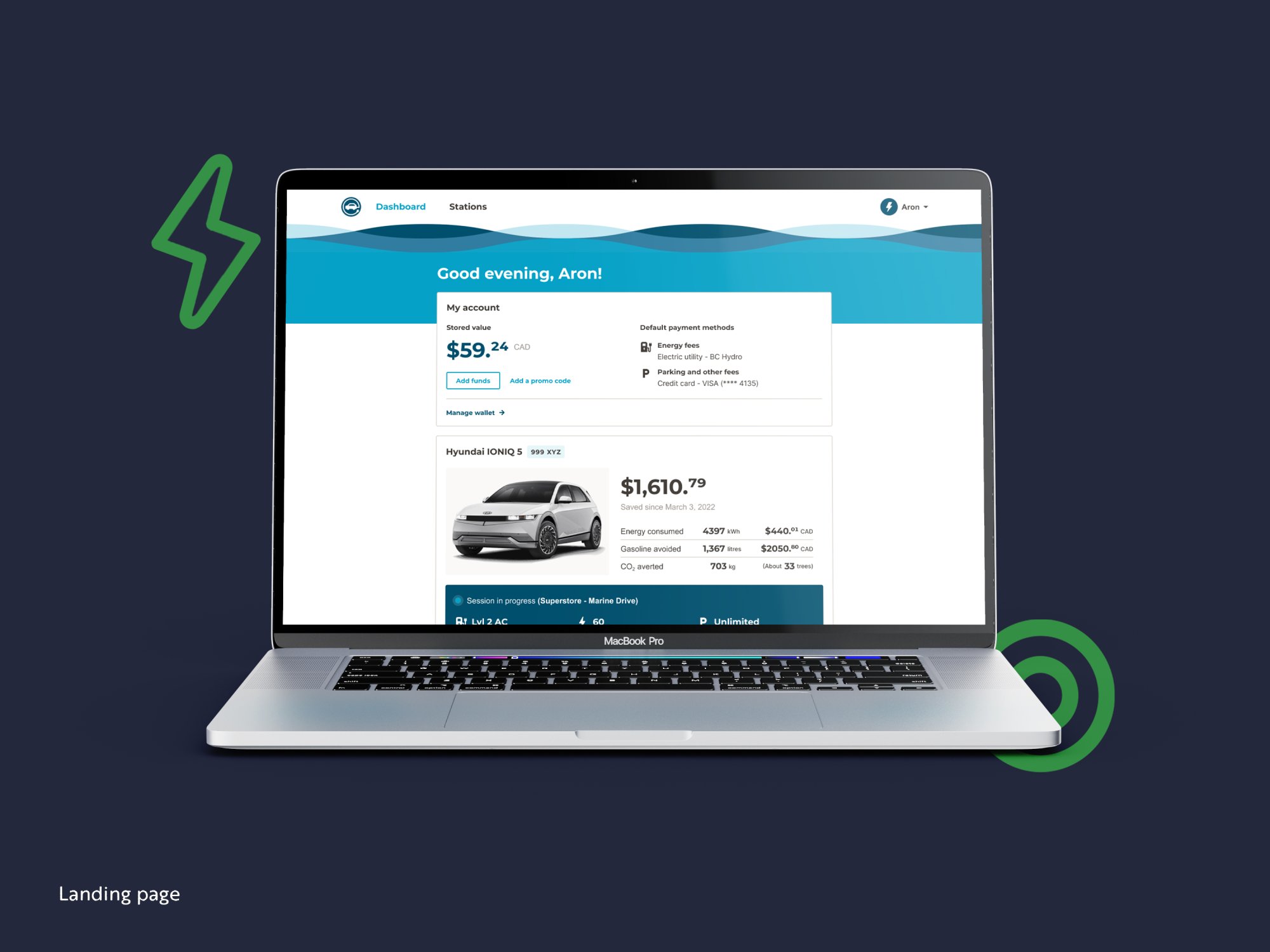
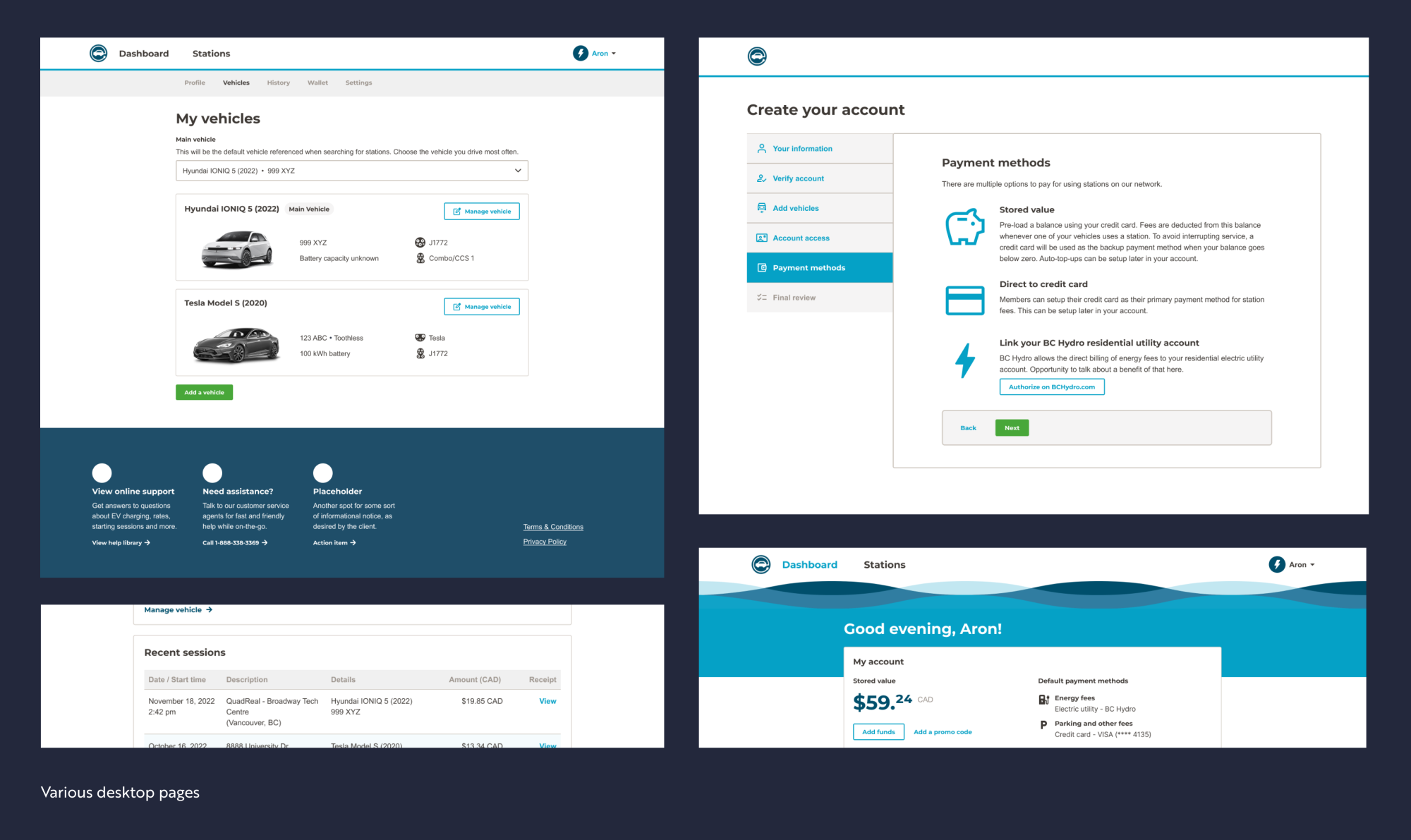
Crafting the EV driver web application (desktop, mobile)
In the first design stage, we developed the web application for EV drivers. Utilizing insights from the discovery phase, we outlined the initial flows for account creation, vehicle charging, the user dashboard, and account management. Each flow underwent multiple rounds of refinement based on feedback, particularly where the client anticipated incorporating new integrations or technologies. Each flow was designed as a white-label solution to meet the branding and functional needs of future B2B clients.
Tailoring screen layout for function and purpose
We advocated for a dashboard design that avoided using the full width of the display on desktop. This approach follows UX best practices by reducing cognitive overload and presenting only easily readable, understandable, and actionable information.
Digging deeper into innovative technologies and applications
In this project, our partnership with the developers was key; by looking closely at how Tap&Go's innovative technologies work and how they fit into the overall charging system, we designed those integrations to fit naturally into the product and improved how users interact with them.
Prototyping and validation research
The next step was to vet our design assumptions against the critique of real EV drivers. A quick-fire round of testing was held using a Figma prototype to validate our design approach.
Testing revealed areas that required additional clarity in layout or instruction, particularly where new integrations challenged an existing mental model. Despite these challenges, participants responded positively to the Tap&Go system, highlighting several improvements over existing interfaces. Learnings from testing were applied and the design was proclaimed MVP ready.
With the first product offering deemed a success, Tap&Go was determined to deliver the same high-quality standard of service and design with all other aspects of their system. This led to our next design challenge: designing for station hardware interfaces.
DESIGN PROCESS: PHASE 2
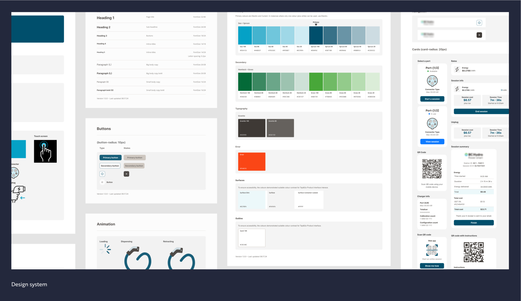
UX for proprietary charging hardware
In this next phase, the team’s attention turned towards refining the interface design of Tap&Go’s charging stations. To address the unique aspects of the hardware, we conducted expert interviews and carried out a detailed analysis of the charging unit and its variations to understand core functionality. This phase was critical in identifying technical constraints and capabilities.
We used this knowledge to craft comprehensive, high-fidelity mockups from Tap&Go's functional interface wireframes. Our design decisions continued to be guided by insights and learnings from discovery and design work we did on the web application.
Ensuring alignment across touchpoints
As with any service or system that exists on multiple platforms, it is critical to ensure cohesiveness across all touchpoints in the experience. We conducted a thorough review to ensure that the evolving MVP aligned with the charger interface, while also identifying potential issues that could arise later. This process helped unify the design system and provided valuable insights for prioritizing the product roadmap.
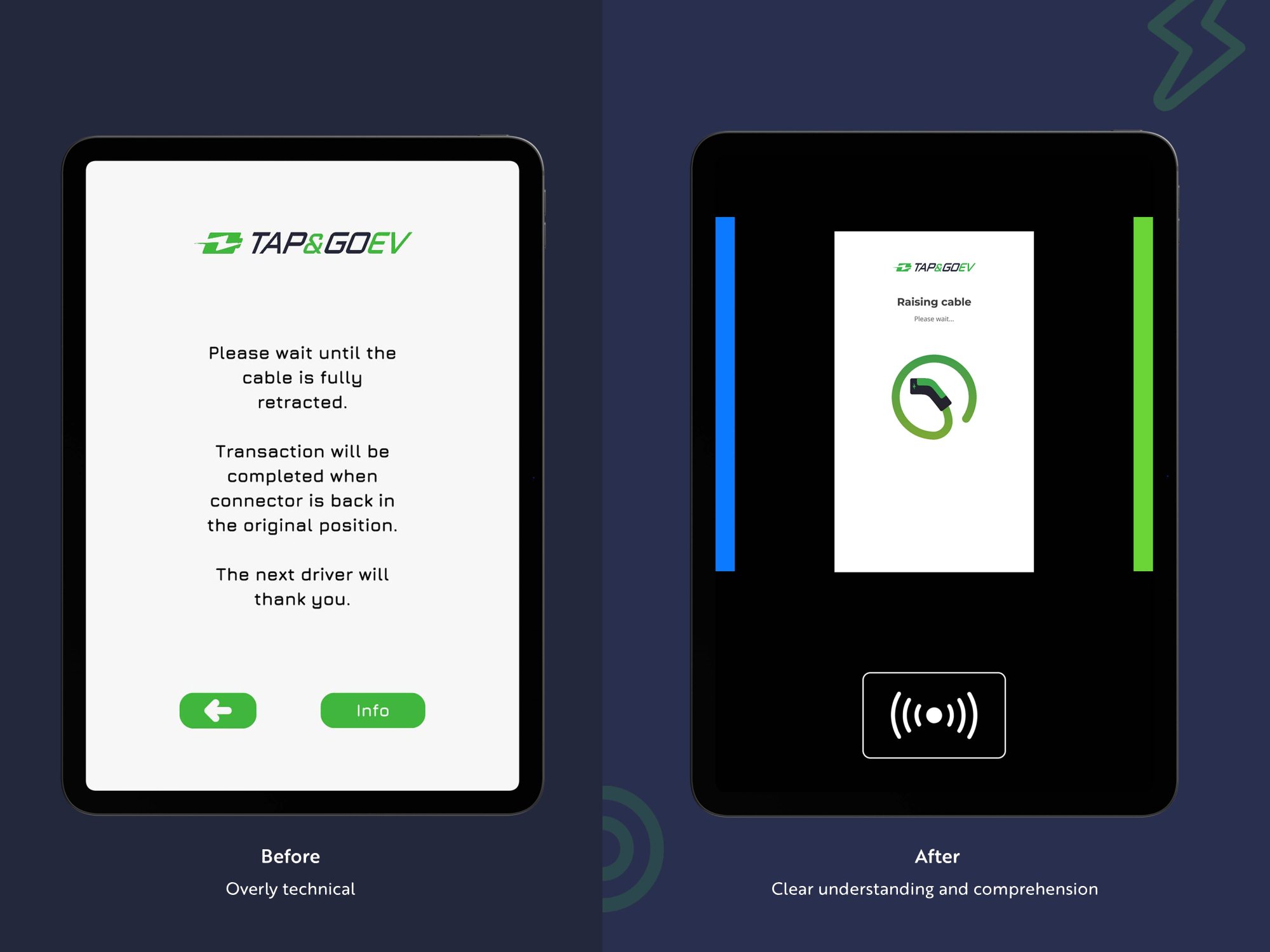
Converting technical terms into user-friendly language
All too often, product teams create user layouts that use overly technical or internal language; this often confuses or alienates end users. Our UX designers identified these terms and provided alternatives that supported clear understanding and comprehension.
Following revisions that arose from the research, the charger screens were given a final review by the client and approved. The interface screen designs and development specifications were delivered to Tap&Go in both branded and white-label configurations.
Tap&Go could have skipped research in the phase 2 designs – a decision not uncommon in the industry. However, by dedicating time to research, they were able to uncover and resolve issues with the charger interface and its misalignment with aspects of the mobile app. This proactive approach prevented costly corrections later, ultimately saving their team tens of thousands of dollars in development expenses.